The shear power of Apple on its install base (#apple #ecosystem #installbase #iPadOS #iOS)

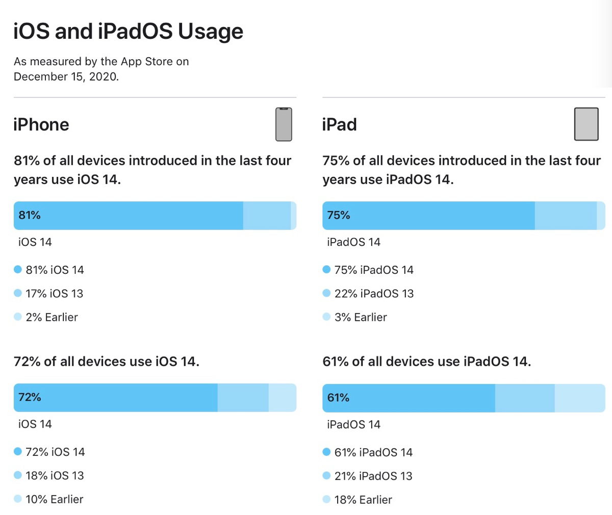
Is this new? I mean the format in which Apple is presenting the current iOS and iPadOS usage? The last time I paid attention to this, Apple was using a pie chart. I prefer this level of details. A few thoughts about these numbers are in order.
First, iPhone users are quicker to update their devices compared to iPad users. Second, Apple makes a clear distinction between devices recently introduced (in the last four years) from the rest. In both categories, the numbers shows that a vast majority of users adopt the latest release of the operating system. Third, even though people keeps their device longer than before, Apple keep supporting older devices (older than four years). All of this helps keeping the adoption rate at very high levels. Kudos to Apple.
These numbers also tell another story: Apple’s shear power over its install base is impressive. Apple has the ability to move it in new directions pretty quickly as users are quick to embrace new features, either by buying new devices or by updating their current ones because they are still supported by Apple. Will 2021 bring a different tone to this story with iOS 15? Maybe, maybe not.